Have you ever considered how 19th century sans serif typefaces revolutionized the world of typography? These fonts emerged during a period of rapid change, yet their origins and significance are often overlooked, leaving many to question their impact on modern design.
This article will delve into the origins and early developments of sans serif typefaces, highlighting their key characteristics and the profound influence of industrialization on type design. Understanding these elements will enhance your appreciation for typography and its evolution.
We will explore the fascinating journey of sans serif fonts, examining their defining traits and how they shaped visual communication in an ever-evolving industrial landscape.
Origins and early developments of sans serif typefaces
The origins of sans serif typefaces can be traced back to the late 18th century, although their widespread use did not occur until the 19th century. The term “sans serif” literally means “without serif,” referring to the absence of the decorative strokes at the ends of letters. This design was a departure from the traditional serif typefaces that had dominated printing.
One of the earliest examples of sans serif typefaces is the Caslon Sans, created by William Caslon IV in 1816. This typeface was a significant milestone, as it marked the transition toward simpler, more modern typography. Caslon IV, the grandson of the famed type designer William Caslon, aimed to create a typeface that matched the growing demand for clarity and legibility in printed materials.
- 1816: William Caslon IV introduces Caslon Sans.
- 1832: The Grotesque typeface appears, becoming popular in advertising and posters.
- 1845: The first sans serif typeface with a complete family, Akzidenz-Grotesk, is released.
As the 19th century progressed, sans serif typefaces evolved further. The Grotesque style emerged, characterized by its geometric forms and uniform stroke weights. This style was particularly popular in commercial printing, as it offered a bold aesthetic that captured attention. The use of sans serif typefaces in advertising and signage started to rise, reflecting the industrial revolution’s impact on design.
The mid to late 1800s saw the emergence of notable typefaces such as Frank Ruhl and Berthold Akzidenz Grotesk, both of which contributed to the establishment of sans serif as a staple in typography. These designs not only provided a modern look but also enhanced readability, making them suitable for various applications, from newspapers to posters.
By the end of the century, sans serif typefaces were firmly embedded in the typographic landscape. Their clean lines and straightforward aesthetics paved the way for modern typography, influencing designers and typographers for generations to come.
Key characteristics of 19th century sans serif fonts
The 19th century saw the emergence of distinctive characteristics in sans serif typefaces that set them apart from their serif counterparts. These fonts were designed with clarity and legibility in mind, reflecting the changing needs of print and communication during the Industrial Revolution.
- Geometric Shapes: Many sans serif fonts from this period featured geometric forms, emphasizing simplicity and uniformity. For example, fonts like Akzidenz-Grotesk, introduced in 1898, showcased clean lines and balanced proportions.
- Neutral Design: The designs were often neutral, avoiding any ornate details. This made them versatile for various applications, from advertising to signage. The intent was to convey information clearly without distraction.
- Uniform Stroke Weight: A notable feature was the consistent stroke weight throughout the characters. Unlike serif fonts, which have varying widths, sans serif types maintained a uniform thickness, enhancing readability.
Another important aspect of these fonts was their adaptability. As industries grew and the demand for printed materials increased, sans serif typefaces became highly popular due to their modern aesthetic. They were particularly favored in advertising and public signage for their straightforward appearance.
- Increased Use in Advertising: The clean look of sans serif fonts made them ideal for eye-catching posters and advertisements. For instance, the use of Frank Ruhl in the early 20th century became synonymous with bold, impactful advertising.
- Wide Variety: The 19th century also witnessed a proliferation of sans serif designs, each with unique characteristics. This included fonts like Grotesque and Gothic, which varied slightly in style but shared the core principles of sans serif design.
The key characteristics of 19th century sans serif fonts included geometric shapes, neutral designs, and uniform stroke weights. Their adaptability and increasing popularity in advertising marked a significant shift in typography, laying the foundation for modern typeface design.
Influence of industrialization on type design
The 19th century was a time of significant change due to the effects of industrialization, which had a profound impact on type design. As factories emerged and mass production became the norm, there was a growing demand for efficient and legible typefaces that could be produced quickly and used effectively in various applications.
Industrialization led to advancements in printing technology, such as the steam-powered printing press, which allowed for faster printing processes. This technological evolution prompted type designers to create sans serif typefaces that could be easily read at a distance, making them ideal for advertisements, signage, and other commercial uses.
- Increased Legibility: Sans serif typefaces offered improved clarity, especially in the crowded urban environments of the time.
- Bold Aesthetic: The bold, clean lines of sans serif fonts matched the modernity and efficiency of industrial life.
- Versatility: These typefaces were adaptable for various applications, from newspapers to posters.
One notable example of the influence of industrialization on type design is the creation of the font Grotesque, which emerged in the early 19th century. Designed by William Caslon IV in the 1810s, Grotesque was one of the first sans serif typefaces and was specifically created for the burgeoning print industry. Its geometric forms and lack of serifs made it a popular choice for a wide range of printed materials.
Another influential typeface was Akzidenz-Grotesk, developed by the Berthold Type Foundry in 1896. This typeface exemplified the industrial aesthetic with its simple, unadorned design, which resonated with the values of efficiency and functionality that characterized the industrial age.
The influence of industrialization on type design was significant. The demand for more legible, versatile, and modern typefaces resulted in the rise of sans serif fonts. These typefaces not only reflected the changing landscape of the 19th century but also shaped the future of typography, paving the way for countless innovations in type design.
Notable designers and type foundries of the era
During the 19th century, several key designers and type foundries played a significant role in the development of sans serif typefaces. Their innovations and contributions helped shape the visual landscape of typography.
One of the most influential figures was William Caslon IV, who created one of the earliest sans serif typefaces in 1816. His typeface, known as “Egyptian,” marked a departure from traditional serif styles and showcased a bold, modern aesthetic.
- Vincent Figgins – Figgins, a notable type designer, released a sans serif typeface called “Antique” in 1832. This font was characterized by its geometric shapes and was widely adopted for display purposes.
- Joseph Fry – Fry’s foundry introduced “Fry’s Antique” in 1846, which further exemplified the sans serif style with its clean lines and simplicity.
- Richard Austin – Known for his work in the 1840s, Austin’s designs contributed to the popularity of sans serif typefaces in advertising and signage.
Another pivotal name is Charles Reed, who is credited with the introduction of the “Reed” typeface. This design gained attention for its unique blend of modernity and readability, making it suitable for various applications, from newspapers to posters.
The emergence of type foundries also played a crucial role. For instance, the London-based foundry established by Figgins became famous for producing high-quality sans serif types. Similarly, the American Type Founders, formed in 1892, was instrumental in bringing numerous sans serif designs to the American market.
In the late 19th century, the demand for sans serif typefaces surged, leading to the development of many new styles. The popularity of these fonts was not limited to print; they also found their way into advertising and commercial use, reflecting the changing tastes of society.
As a result of these contributions, the 19th century witnessed a significant evolution in typography, laying the groundwork for modern sans serif designs that continue to be used today. The legacy of these designers and foundries demonstrates their lasting impact on the field of type design.
Comparison between serif and sans serif styles in the 19th century
The comparison between serif and sans serif styles in the 19th century reveals significant differences in aesthetics, functionality, and usage. While serif typefaces were traditionally associated with formal and classic designs, sans serif fonts emerged as a modern alternative, catering to the changing tastes of the era.
One of the most notable distinctions was in legibility. Sans serif fonts, such as those developed by the foundry of William Caslon IV, were often perceived as easier to read in display settings. This was crucial as the rise of advertising and print media demanded typefaces that could capture attention quickly. In contrast, serif fonts were predominantly used in books and formal documents, emphasizing tradition.
- Serif Fonts: Characterized by small lines or decorative strokes at the ends of letters, they provided a sense of stability and authority.
- Sans Serif Fonts: Lacking these embellishments, they conveyed a sense of modernity and simplicity, appealing to a rapidly industrializing society.
By the mid-19th century, it was estimated that sans serif fonts comprised about 30% of all printed material, highlighting their growing popularity. This shift can be attributed to the increased demand for signage, advertisements, and posters that required bold, clear typography. For example, the introduction of the typeface “Grotesque” by the foundry of Vincent Figgins in 1832 marked a turning point, showcasing how sans serif designs could effectively serve commercial needs.
Another significant factor was the cultural context. The Industrial Revolution brought about a shift in societal values, favoring innovation and progress. As a result, sans serif fonts were often adopted for their ability to symbolize modernity and break away from the constraints of the past. This cultural movement fostered an environment where designers like Henri Didot and others began exploring new typeface designs that pushed boundaries.
The 19th century marked a transformative period for typography. The contrast between serif and sans serif styles highlighted the evolving preferences and requirements of society, setting the stage for future developments in type design. As these trends continued to evolve, they laid the groundwork for the diverse typographic landscape we see today.
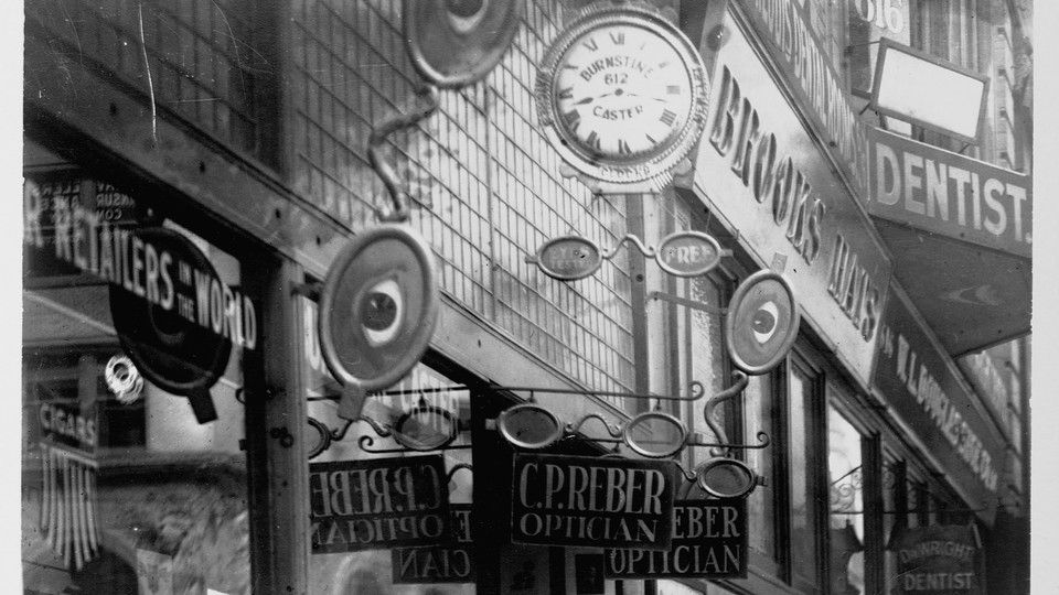
Applications of sans serif typefaces in 19th century advertising
During the 19th century, the rise of industrialization coincided with a booming advertising industry. Sans serif typefaces became increasingly popular in advertisements due to their clean and modern appearance. This style was particularly effective in grabbing the attention of consumers in rapidly urbanizing environments.
One notable example is the use of sans serif typefaces in the advertising campaigns of the London Underground, which began operating in the 1860s. The use of bold sans serif fonts helped in creating clear and legible signage, essential for navigating the bustling city. The typeface known as Johnston Sans was specifically developed for this purpose, emphasizing clarity and simplicity.
- Clarity: Sans serif typefaces provided a straightforward reading experience, making them ideal for posters and billboards.
- Modernity: The lack of serifs gave these typefaces a contemporary feel, aligning with the progressive attitudes of the time.
- Versatility: Sans serif fonts were adaptable for various advertising materials, from newspapers to large-format prints.
In the United States, the 1890s saw a surge in the use of sans serif typefaces in advertising. The famous type foundry, ATF (American Type Founders), introduced several sans serif styles that became staples in print advertising. For example, the typeface known as Grotesque was widely utilized for its boldness and readability, making it a favorite among advertisers.
Another example can be seen in the advertising for department stores in major cities. The clarity of sans serif typefaces allowed for effective communication of promotions and sales. Retailers like Lord & Taylor adopted these fonts in their flyers and posters to attract customers with visually striking messages.
Overall, the applications of sans serif typefaces in 19th century advertising were pivotal in shaping how brands communicated with consumers. The distinctive look of sans serif fonts not only facilitated better readability but also represented a shift towards modernity in visual culture.
Evolution of sans serif typefaces towards the 20th century
As the 19th century came to a close, the evolution of sans serif typefaces laid the groundwork for significant transformations in typography. The shift from traditional serif fonts to sans serif styles reflected broader cultural and technological changes. This transition was marked by several key developments:
- Increased Industrialization: The industrial revolution led to greater demand for clear and legible typefaces, particularly in advertising and signage.
- Advancements in Printing Technology: Innovations such as the steam-powered printing press allowed for more efficient production of typefaces, encouraging experimentation with new styles.
- Artistic Movements: The rise of modernist movements influenced typographic design, emphasizing simplicity and functionality over ornate styles.
By the early 20th century, numerous designers began to experiment with sans serif typefaces, leading to the creation of iconic fonts. Notable examples include:
- Futura (1927): Designed by Paul Renner, this geometric sans serif became influential in the Bauhaus movement.
- Helvetica (1957): Created by Max Miedinger, this typeface epitomized modernist principles and gained widespread popularity.
During this period, sans serif fonts began to be perceived not just as utilitarian but as aesthetically pleasing. The following factors contributed to their growing acceptance:
- Readability: Sans serif typefaces were easier to read at various sizes, making them suitable for both print and digital media.
- Minimalism: The clean lines of sans serif styles aligned with minimalist design trends, appealing to modern sensibilities.
Moreover, the influence of advertising and branding catalyzed the adoption of sans serif fonts. For instance, the clear and bold appearance of these typefaces made them ideal for logos and promotional materials. Companies like Coca-Cola and IBM embraced sans serif styles in their branding efforts, showcasing their modern image.
As the 20th century progressed, the evolution of sans serif typefaces continued, leading to a diverse range of styles that remain influential to this day. The groundwork laid in the 19th century paved the way for the dynamic typography we see in contemporary design.
Preservation and digital revival of 19th century sans serif fonts
The preservation and digital revival of 19th century sans serif fonts have become critical in maintaining the historical significance of these typefaces. As technology advanced, many designers recognized the need to digitize classic fonts to ensure their availability for modern use. This process involves meticulous research and careful reconstruction of original designs.
One notable example is the revival of the Grotesque typefaces, such as the one designed by William Caslon IV in the early 19th century. These fonts were essential in shaping modern typography, and their revival has allowed contemporary designers to incorporate historical elements into their work.
- Digital Preservation: Involves scanning original type specimens and creating vector versions.
- Font Foundries: Companies like Adobe and Google Fonts offer digital versions of historical typefaces.
- Type Design Communities: Online platforms support collaborative efforts to revive and share fonts.
In recent years, various digital type foundries have focused on reviving these fonts. For instance, Font Bureau released a digital version of Frank Ruhl Libre, a typeface originally designed in 1899. This revival is not only a nod to history but also demonstrates the ongoing relevance of these typefaces in contemporary design.
The process of digital revival often includes adjustments to enhance legibility on screens. For example, 19th century sans serif fonts were not originally designed for digital use. Designers like David Jonathan Ross have played a significant role in adapting these fonts, ensuring they maintain their historical charm while being functional in a digital context.
| Font Name | Designer | Year | Digital Revival |
|---|---|---|---|
| Grotesque | William Caslon IV | 1816 | Font Bureau |
| Frank Ruhl | Ismar David | 1899 | Google Fonts |
As we move forward, the digital revival of 19th century sans serif fonts serves as a bridge connecting past and present. This revitalization not only honors historical typographic traditions but also enriches the modern design landscape, ensuring that these typefaces remain relevant and appreciated.
Impact of 19th century sans serif designs on modern typography
The impact of 19th century sans serif designs on modern typography is profound. These typefaces not only revolutionized how text was presented but also influenced the aesthetics and functionality of contemporary design. The clean lines and minimalistic approach of sans serif fonts have become a staple in various design disciplines.
One of the primary contributions of 19th century sans serif typefaces is their role in enhancing readability. As advertising and public signage became more prevalent, designers sought fonts that could be easily read from a distance. This trend laid the groundwork for modern typefaces that prioritize clarity and legibility.
- Helvetica (1957) – A direct descendant of 19th century sans serif designs, known for its versatility and neutrality.
- Arial (1982) – Created as a more modern alternative to Helvetica, it remains widely used in digital formats.
- Futura (1927) – While slightly later, it was influenced by the geometric sans serif trends that began in the 19th century.
Modern typography continues to borrow elements from these early designs. The emphasis on simplicity and functionality can be traced back to the sans serif typefaces developed during the 19th century. For instance, the use of space and alignment in contemporary layouts reflects the principles established by earlier sans serif fonts.
In addition, the aesthetic of 19th century sans serif types has been embraced in branding and digital design. Companies today often use these typefaces to convey a sense of modernity and professionalism. A notable example is the branding of tech giants like Google and Facebook, which utilize sans serif fonts to project a clean and approachable image.
Furthermore, the rise of web design has solidified the importance of sans serif typefaces. With the shift to digital platforms, fonts like Roboto and Open Sans have gained popularity, echoing the minimalist ethos of their 19th century predecessors. This evolution demonstrates how the foundational work done in the 19th century continues to inform and inspire modern typographic choices.
Frequently Asked Questions
What are the key characteristics of 19th century sans serif typefaces?
The key characteristics of 19th century sans serif typefaces include clean lines, minimal ornamentation, and a modern aesthetic that emphasizes readability. These typefaces often feature uniform stroke widths and a geometric form, which set them apart from the more decorative serif fonts of the time.
How did 19th century sans serif typefaces influence graphic design?
19th century sans serif typefaces had a significant impact on graphic design by introducing versatility and a contemporary feel to printed materials. Their simple, straightforward style allowed designers to create more effective communication in advertisements, posters, and publications, paving the way for modern design principles.
Where can I find digital versions of 19th century sans serif fonts?
Digital versions of 19th century sans serif fonts can be found on various font distribution platforms and websites specializing in typography. Popular sources include Google Fonts, Adobe Fonts, and independent foundries that focus on historical typeface revivals.
Why are 19th century sans serif typefaces important today?
These typefaces are important today because they represent a transitional phase in typography that influences modern design. Their enduring popularity showcases their ability to convey clarity and sophistication, making them relevant for both print and digital applications.
Can I use 19th century sans serif fonts for commercial projects?
Yes, you can use 19th century sans serif fonts for commercial projects, provided you have the appropriate licensing rights. Always check the font’s license agreements, as some may have restrictions on commercial use or require attribution.
Conclusion
The evolution of 19th century sans serif typefaces paved the way for transformative changes in typography, while their preservation and digital revival ensure their historical significance is maintained. Furthermore, these designs profoundly influenced modern typography, shaping how we perceive and utilize text today. By applying insights from 19th century sans serif typefaces, readers can enhance their design projects, creating visually appealing and legible content. Understanding these fonts can lead to improved communication and a stronger connection with audiences. Explore and experiment with these typefaces in your next design project to truly appreciate their impact. Start by integrating a 19th century sans serif font into your work today!